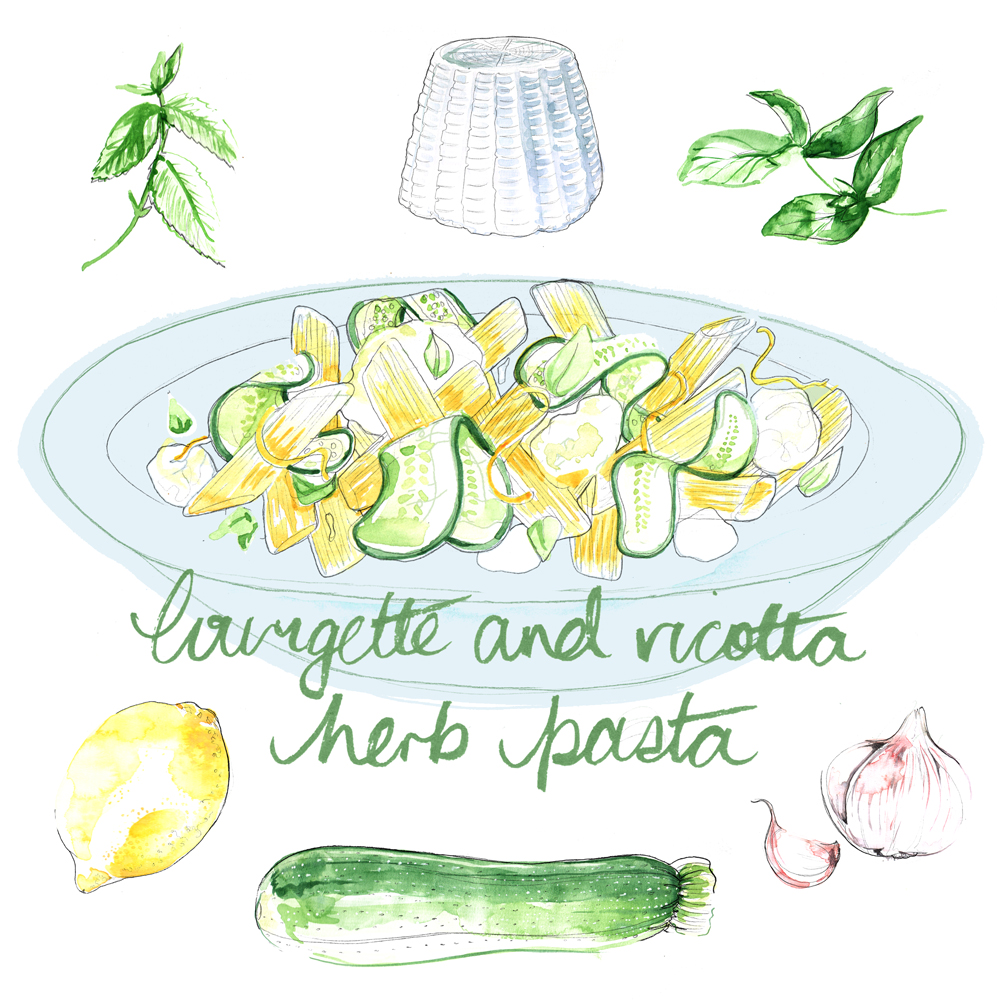
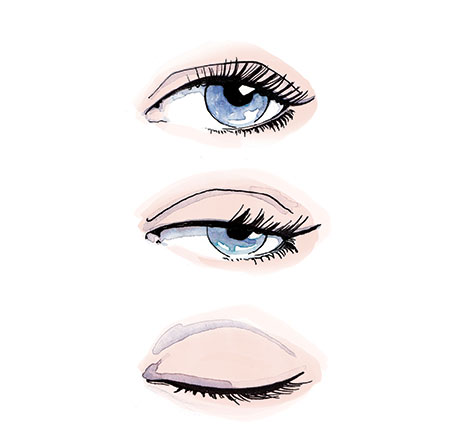
Watercolour illustrations commissioned for Work. magazine
Read MoreAlbum cover illustrations for The Guardian Saturday.
Album cover parodies, illustrated for The Guardian Saturday.
Read MorePress image for Marylebone Village
An illustrated street scene for the press launch of Marylebone Village’s new permanent street installation.
Read MoreMy Most Memorable Meal column for Sainsbury's magazine -part 2
A monthly illustrated column recounting celebrities’ strange and wonderful stories about their most unforgettable dining experiences - part 2
Read MoreMy Most Memorable Meal column for Sainsbury's magazine
A monthly illustrated column recounting celebrities’ strange and wonderful stories about their most unforgettable dining experiences.
Read MoreHow-to exercise illustrations for January
Black and White illustrations for The Guardian's Saturday magazine
Read MoreOak tree - double page spread for Kew magazine
An exploration below one of Kew Gardens’ ancient oaks.
Read MoreFood illustrations for Stylist Magazine
Bento box style recipes for “No more sad sandwiches”
Read MoreBeauty illustrations for Porter digital
A new series of illustrations showcasing Net-a-Porter’s best beauty buys.
Read MoreIllustrations for Country Life Magazine's wedding supplement
Illustrations for Country Life Magazine's wedding supplement
Read MoreBeauty illustrations for Family Fun magazine
Beauty illustrations for Family Fun magazine
Read MoreFashion and body shape illustrations for Precis.
Fashion and body shape illustrations for Precis.
Read MoreFood illustrations for Family Circle magazine US
Food illustrations for Family Circle magazine US
Read MoreNew Work - Portrait for Stella magazine
I was asked to create my smallest ever commission. A teeny tiny portrait for Stella magazine at a miniscule 26mm wide. Despite it's small size, it was no simple task to create a good likeness at this size. I had to use simple, bold lines and strong colour to make it work. A bit different from my normal style.
In fact, the art director, Jason Morris, had contacted me after seeing this ipad drawing on my website. He thought that this style would be ideal for this simple, yet fashionable brief.
So, I set out to create an similar illustration, created with ink and watercolour. And here's what I came up with. Two options. The art director had wanted something straight on, but I felt that the angled head would be more interesting for this graphic piece. I'm pleased that they went with it.
I also created some hand lettering for the article title.
x, Willa
New Work - Food Illustrations for Tesco Magazine.
New Work - Beauty and eye care illustrations for Boots Magazine.
Commissioning illustration for social media.
Recently, I've been creating a lot of illustrations for Tesco. I've worked for their paper magazine before, but this time it's different. I've been creating work especially for their social media outlets; Instagram and Twitter (@BeautyatTesco and @TescoFood). It's the first time I've been commissioned for editorial illustrations in this way, and I think it's pretty exciting.
It's reckoned that a tweet with an imbedded image is much more likely to be retweeted. Hurrah! We've always known that a picture tells a thousand words; which in essence solves the issue of only having 140 characters. Plus, illustration is an perfect way of solidifying your companies brand and making it instantly recognisable.
It's great to see that Tesco are taking their social media seriously; creating new and interesting content while supporting the creative industry. Rather than the all-too-often regurgitation of images that have long lost their copyright owners. I really hope it is succesful for Tesco! If it is, then I'm sure more online magazines and blogs will start using illustrators in this way.
Perhaps this is a new arena for illustrators to excel with the demise of the classical publishing industry?


