An illustrated collaboration with Scottish chocolatier, Quirky chocolate.
Read MoreAn Illustration and Photography Collaboration
A lovely collaboration, using illustration with children's photography.
Read MorePhotography Illustration Collaboration
Last year, during a quiet period, I made it my mission to try some new things and meet new people through collaborations. One of the biggest challenges for me, was my collab with talented still life photographer, Johanna Parkin and the wonderful florist, Geraldine Casey.
Together we created this lovely series of photographs.
We wanted to create a series of images which would blur between reality and illustration. Hoping that it would be difficult to see what was real and what was not. The illustrations on the vases blend into the paper at the base and back.
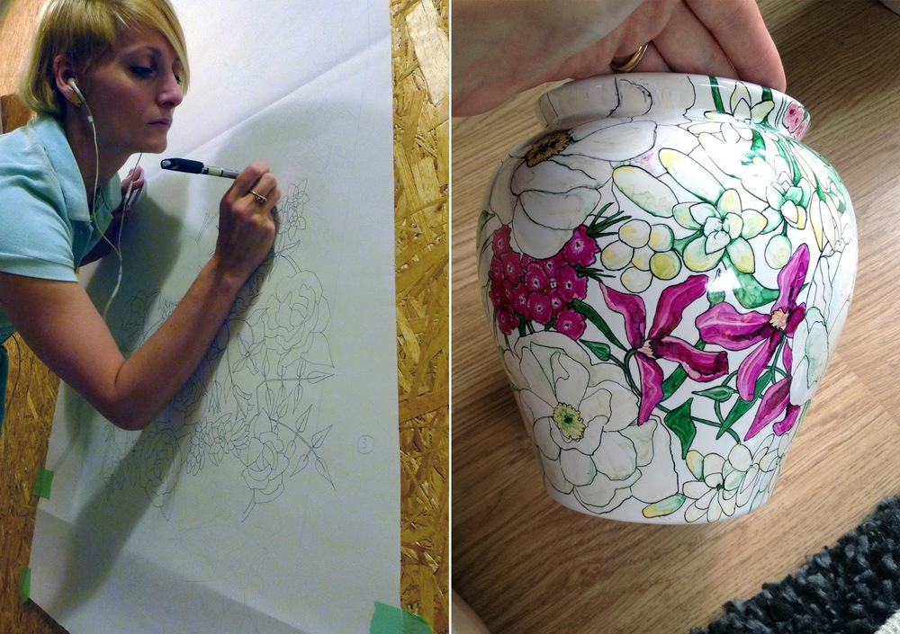
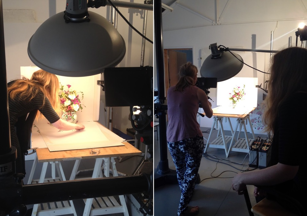
The process was quite complicated; trying to get the illustration to line up with the angle of the camera. That was before we even added the flowers!
There was weeks of preparation to create three large panels and paint three vases. I found it quickest and easiest to work wth letraset promakers, which gave a beautiful watercolour texture on the ceramic. Sadly, though, it meant that the vases weren't watertight. They look great in the pictures but are sadly not much use for holding flowers day-to-day.
The day of photoshoot was one of London's warmest days, which meant that the florist had problems of her own, as the flowers misbehaved.
Johanna needs to be a perfectionist. It's amazing what the camera shows up. I've got a new admiration for the amount of work involved in still-life photography.
Sadly, we ended up not using all three pieces, as the third and most complcated piece didn't hang together in the set. Experimenting in this way was a great way of finding your limits.
I love doing collaborations like this, with new people and with interesting projects (especially when it gets me away from my desk and into the real world).
Let me know what you think.
x, Willa
Together we created this lovely series of photographs.
We wanted to create a series of images which would blur between reality and illustration. Hoping that it would be difficult to see what was real and what was not. The illustrations on the vases blend into the paper at the base and back.
The process was quite complicated; trying to get the illustration to line up with the angle of the camera. That was before we even added the flowers!
There was weeks of preparation to create three large panels and paint three vases. I found it quickest and easiest to work wth letraset promakers, which gave a beautiful watercolour texture on the ceramic. Sadly, though, it meant that the vases weren't watertight. They look great in the pictures but are sadly not much use for holding flowers day-to-day.
The day of photoshoot was one of London's warmest days, which meant that the florist had problems of her own, as the flowers misbehaved.
Sadly, we ended up not using all three pieces, as the third and most complcated piece didn't hang together in the set. Experimenting in this way was a great way of finding your limits.
I love doing collaborations like this, with new people and with interesting projects (especially when it gets me away from my desk and into the real world).
Let me know what you think.
x, Willa
Illustration and Photography Collaboration
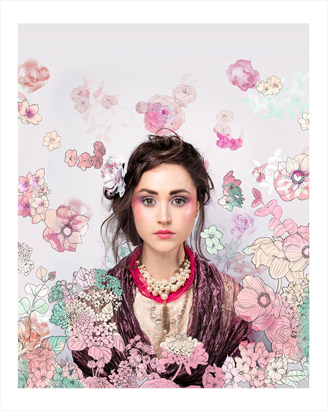
You might remember a few months ago I was at Lorna Milburn's photography studio working on a collaboration. Well, I'm delighted to say that we've had our photographs published in the Anniversary Edition of Elegant Magazine.
It was a great collaboration, working with make up artist, Sam Norman, stylist, Emma Cherry Rolf and model, Samantha Ker . We were also able to use the beautiful creations of the jeweller, Susan O (I have a serious obsession with her necklaces now).
I created both the illustrated backdrop and paper crown for the photoshoot. I then illustrated over the photographs. I'm really pleased with how they turned out.
It was such great fun doing a collaboration. I'm hoping to do many more this year.
Behind the Scenes at my Photography Collaboration
This week I collaborated with the photographer, Lorna Milburn and makeup artist Sam Norman on a photo shoot. I created an illustrated backdrop for the shoot, and created an illustrated paper floral crown for the shoot. I can't wait to share the final photographs when they're finished.
Here's some pictures from behind the scenes.
x, Willa


