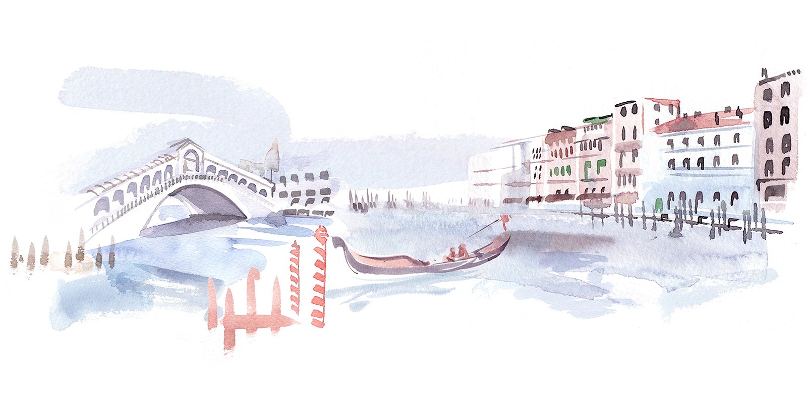
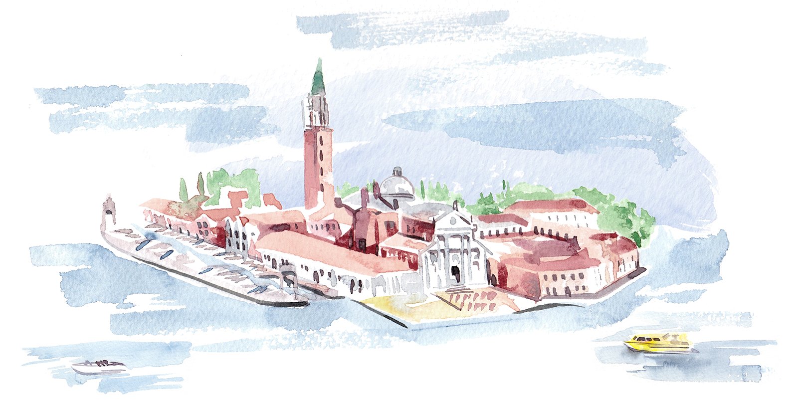
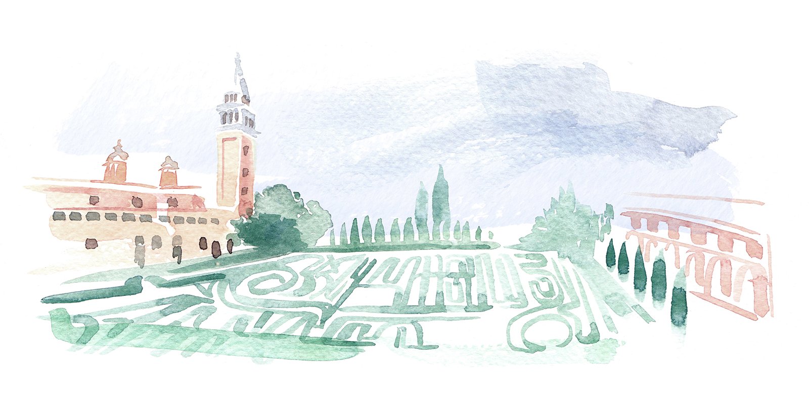
These illustrations of Venice and the Giorgio Cini Foundation are a bit different to my normal style; more abstracted and fluid. They were a lot of fun to create. They were used to add a creative voice to the corporate communications around the planning, and funding the Homo Faber event in Venice.
The artworks form part of a much larger project, creating watercolour swooshes and textures as assets that could be used throughout internal presentations, and stakeholder communications.


